How To Design For Multiple Screen Sizes
Creating Three Sets of Graphics
Because of the aforementioned screen resolution/size issue, Android recommends creating three sets of graphics for:- Hi Density Screens
- Medium Density Screens
- Low Density Screens
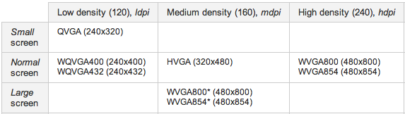
The grid below shows the various screen sizes and resolutions you use for your Photoshop files:
I know it’s a lot. But if you’re creating your design using vector shape layers, the re-sizing process shouldn’t be too painful. The key is to design for the smallest screen first, and then size up for larger screens.
Yorumlar