HTML - Hyber Text Markup Language
HTML stands for Hyper Text Markup Language
HTML describes the structure of Web pages using markup
HTML elements are the building blocks of HTML pages
HTML elements are represented by tags
HTML describes the structure of Web pages using markup
HTML elements are the building blocks of HTML pages
HTML elements are represented by tags
<!DOCTYPE html> declaration defines this document to be HTML5Simple HTML 5 structure
<!DOCTYPE html>
<html>
<head>
<meta charset="UTF-8">
<title>The title of this document</title>
</head>
<body>
</body>
new 8 semantic elements;
- article
- aside
- figure
- footer
- header
- main
- section
- nav
What are Semantic Elements?
A semantic element clearly describes its meaning to both the browser and the developer.
Examples of non-semantic elements:
<div> and <span> - Tells nothing about its content.
Examples of semantic elements:
<form>, <table>, and <article> - Clearly defines its content.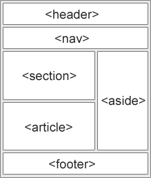
- article - Defines an article
- aside - Defines content aside from the page content
- details - Defines additional details that user can view or hide
- figure - Specifies self-contained content, like illustrations, diagrams, photos, code listings, etc.
- figcaption - Defines a caption for a <figure> element
- footer - Defines a footer for a document or section
- header - Specifies a header for a document or section
- main - Specifies the main content of a document
- mark - Defines marked and highlighted text
- nav - Defines navigation links
- section - Defines a section in a document.
- summary - Defines a visible heading for a <details> element
- time - Defines a date/time
The
<aside> element defines some content aside from the content it is placed in (like a sidebar).
The
<aside> content should be related to the surrounding content.Why Semantic Elements?
With HTML4, developers used their own id/class names to style elements: header, top, bottom, footer, menu, navigation, main, container, content, article, sidebar, topnav, etc.
This made it impossible for search engines to identify the correct web page content.
With the new HTML5 elements (
<header> <footer> <nav> <section> <article>), this will become easier.
According to the W3C, a Semantic Web: "Allows data to be shared and reused across applications, enterprises, and communities."
The Difference Between <article> <section> and <div>
In the HTML5 standard, the
<section> element is defined as a block of related elements.
The
<article> element is defined as a complete, self-contained block of related elements.
The
<div> element is defined as a block of children elements.Meta Data
To ensure proper interpretation and correct search engine indexing, both the language and the character encoding should be defined as early as possible in a document.
Setting The Viewport
A
<meta> viewport element gives the browser instructions on how to control the page's dimensions and scaling.
<meta name="viewport" content="width=device-width, initial-scale=1.0">
The width=device-width part sets the width of the page to follow the screen-width of the device (which will vary depending on the device).
The initial-scale=1.0 part sets the initial zoom level when the page is first loaded by the browser.
HTML Comments
<!-- This is a comment -->
Style Sheets
<link rel="stylesheet" href="style.css"/>
Loading JavaScript in HTML
<script src="myscript.js"/>
Formatting elements were designed to display special types of text:
<b>- Bold text<strong>- Important text<i>- Italic text<em>- Emphasized text<mark>- Marked text<small>- Small text<del>- Deleted text<ins>- Inserted text<sub>- Subscript text<sup>- Superscript text
The HTML
<b> element defines bold text, without any extra importance.
The HTML
<strong> element defines strong text, with added semantic "strong" importance.
The HTML
<i> element defines italic text, without any extra importance.
The HTML
<em> element defines emphasized text, with added semantic importance.Styling HTML with CSS
CSS stands for Cascading Style Sheets.
CSS describes how HTML elements are to be displayed on screen, paper, or in other media.
Inline CSS;
<h1 style="color:blue;">This is a Blue Heading</h1>
Internal CSS;
An internal CSS is defined in the <head> section of an HTML page, within a <style> element:
<!DOCTYPE html>
<html>
<head>
<style>
body {background-color: brown;}
h1 {color: blue;}
p {color: red;}</style>
</head>
<body>
<html>
<head>
<style>
body {background-color: brown;}
h1 {color: blue;}
p {color: red;}</style>
</head>
<body>
External CSS;
<!DOCTYPE html>
<html>
<head>
<link rel="stylesheet" href="styles.css">
</head>
<body>....</body>
</html>
<html>
<head>
<link rel="stylesheet" href="styles.css">
</head>
<body>....</body>
</html>
The CSS
border property defines a border around an HTML element:
p {
border: 1px solid red;}
border: 1px solid red;}
The CSS
padding property defines a padding (space) between the text and the border:
p {
border: 1px solid red;
padding: 30px;}
border: 1px solid red;
padding: 30px;}
The CSS
margin property defines a margin (space) outside the border:
p {
border: 1px solid red;
margin: 50px;}
border: 1px solid red;
margin: 50px;}
HTML Images
<img src="url">
The
alt attribute provides an alternate text for an image, if the user for some reason cannot view it (because of slow connection, an error in the src attribute, or if the user uses a screen reader).
<img src="img_chania.jpg" alt="Flowers in Chania">
If a browser cannot find an image, it will display the value of the
alt attribute.
Note: Always specify the width and height of an image. If width and height are not specified, the page might flicker while the image loads.
Image Maps
The
<map> tag defines an image-map. An image-map is an image with clickable areas.
<img src="workplace.jpg" alt="Workplace" usemap="#workmap">
<map name="workmap">
<area shape="rect" coords="34,44,270,350" alt="Computer" href="computer.htm">
<area shape="rect" coords="290,172,333,250" alt="Phone" href="phone.htm">
<area shape="circle" coords="337,300,44" alt="Coffee" href="coffee.htm">
</map>
<map name="workmap">
<area shape="rect" coords="34,44,270,350" alt="Computer" href="computer.htm">
<area shape="rect" coords="290,172,333,250" alt="Phone" href="phone.htm">
<area shape="circle" coords="337,300,44" alt="Coffee" href="coffee.htm">
</map>
The <picture> Element
HTML5 introduced the
<picture> element to add more flexibility when specifying image resources.
The
<picture> element contains a number of <source> elements, each referring to different image sources. This way the browser can choose the image that best fits the current view and/or device.
Each
<source> element have attributes describing when their image is the most suitable.
The browser will use the first
<source> element with matching attribute values, and ignore any following <source> elements.
<picture>
<source media="(min-width: 650px)" srcset="img_pink_flowers.jpg">
<source media="(min-width: 465px)" srcset="img_white_flower.jpg">
<img src="img_orange_flowers.jpg" alt="Flowers" style="width:auto;">
</picture>
<source media="(min-width: 650px)" srcset="img_pink_flowers.jpg">
<source media="(min-width: 465px)" srcset="img_white_flower.jpg">
<img src="img_orange_flowers.jpg" alt="Flowers" style="width:auto;">
</picture>
Show one picture if the browser window (viewport) is a minimum of 650 pixels, and another image if not, but larger than 465 pixels.
document.getElementById("myHeader").innerHTML = "Go go";
document.getElementById("demo").style.fontSize = "25px";
document.getElementById("demo").style.color = "red";
document.getElementById("demo").style.backgroundColor = "yellow";
document.getElementById("demo").style.color = "red";
document.getElementById("demo").style.backgroundColor = "yellow";
document.getElementById("image").src = "picture.gif";
The HTML <noscript> Tag
The
<noscript> tag is used to provide an alternate content for users that have disabled scripts in their browser or have a browser that doesn't support client-side scripts
<script>
document.getElementById("demo").innerHTML = "Hello JavaScript!";</script>
<noscript>Sorry, your browser does not support JavaScript!</noscript>
document.getElementById("demo").innerHTML = "Hello JavaScript!";</script>
<noscript>Sorry, your browser does not support JavaScript!</noscript>
Responsive Text Size
The text size can be set with a "vw" unit, which means the "viewport width".
<h1 style="font-size:10vw">Hello World</h1>
Viewport is the browser window size. 1vw = 1% of viewport width. If the viewport is 50cm wide, 1vw is 0.5cm.
Media Queries
In addition to resize text and images, it is also common to use media queries in responsive web pages.
With media queries you can define completely different styles for different browser sizes.
Example: resize the browser window to see that the three div elements below will display horizontally on large screens and stacked vertically on small screens.
<style>
.left, .right {
float: left;
width: 20%; /* The width is 20%, by default */}
.main {
float: left;
width: 60%; /* The width is 60%, by default */}
/* Use a media query to add a breakpoint at 800px: */
@media screen and (max-width: 800px) {
.left, .main, .right {
width: 100%; /* The width is 100%, when the viewport is 800px or smaller */
}}</style>